Category Archives: Analytics Crossroads

Does your data have any personality?

Tables, rows, columns, arrays, cross tabs, flat files… All filled with nicely structured bits of information.  But in this cold barren digital landscape can we find any shred of personality? Yes, but only if your willing to work to expose it. Some would call this data exploration. This works if we stay in that cold calculated space, but why not treat your data more like a debutante being announced at the ball.

So it’s kinda of cliche’. YES, but this stems from a prior post on information intimacy.  http://wp.me/p3DKQR-S

As you evaluate your data composition, n counts, data types, value relationships, etc, etc, etc, you are assigning traits along the way.

At www.dictionary.com we see the following:

“the organized pattern of behavioral characteristics of the individual.” [WHY NOT DATA?]

This fits… Where you will see pronounced personality of data is once you venture into the expanding role of unstructured data.  Open text fields, memo fields, verbatim files, video, voice. Is not theme detection an attempt to gist clarity from large quantities of abstract text fields?

This is an excerpt from a June 2012 Intel white paper:

Unstructured data is growing faster than structured data. According to a 2011 IDC study, it will account for 90 percent of all data created in the next decade. As a new, relatively untapped source of insight, unstructured data analytics can reveal important interrelationships that were previously difficult or impossible to determine.”

These personality traits will continued to develop as you “mash” or combine disparate data into different  combinations of explorable data sets.  Also keep in mind that your observations should be guided by a range of business imperatives… “Why know the Why?”

So as you journey through structured and unstructured data (hopefully both[together]) keep in mind that insights HIDE in the mundane, are exposed by the curious and usually start with a statement like “well that’ s weird.”


Big Data and Starfish…

Does looking at all the available data REALLY MATTER?  With the velocity of data and the constant deluge of new sources can you even make a dent? Can the cost of the journey be offset by the value of the destination?  starfish

My Dad used to tell me a story when I was younger.  A man is walking down a beach that is littered with beautiful starfish.  As the man came across the beached starfish he would pick them up and gently toss them back into the surf.  He continued on for quite a while when a man coming from the other direction stopped and asked him.  “Do you really think you can make a difference when there are so many beached starfish?” The man reflected for a minute, then looked down at the dying starfish in his hand.  He looked back up at the man who asked the question and said… It makes a big difference to this one.

While working for a CPG company as part of a key corporate project team, we encountered a HUGE stall point due to the format and quantity of all the data.  How would we work with it?  How could we add additional data?  How could we connect the data? By understanding the value of each “Starfish” we were able to chart a course that, IN FACT, made a difference. The result: millions in potential savings through improved spending models.

Data agility…What makes it difficult?

jumbled data

uhhh…. In a nutshell it’s driven by data variety.  (Not just the composition of data but also varied sources)

But what does that look like? Let’s say in Company “A” the sales department would like to analyze some sales data on Product “X”.  OK easy right? you pull a (insert data source here) shipment report, pick some date ranges, and run your report.  But now a spike in a given time frame prompts some additional questions… Why did that happen? What drove the increase? How does that compare to last year, last quarter, last period? Was it one or more sales divisions, customers, geographical areas? and the “WHY’s” create an avalanche that leads to… WE NEED MORE DATA!!!!!

Marketing suggests running a media spend report for some correlation to advertising activity. Someone else prompts looking at retail sales for the identified product across your re-sellers or retailers.  Your Social Media team wants to contribute data on FB “Likes”, Engagement, customer digital behavior, and NOW it’s gets interesting…  different departments, different systems, different data formats, different report layouts, different data outputs (csv, pdf, xls, mht) and on and on and on. Plus you now have different business stakeholders all with a slightly different “end game” in mind with regards to the business insight objective.

Is everyone seeing what’s different?

Here is one of my favorites… you have some key metrics you’d like to plot across time on a line graph.  However, for each metric (on each report) the date is different in both format and frequency.  Your sales report is weekly i.e. w/ending x/xx/xxxx.  Your finance report is monthly Month/Yr. Your Social Media report is daily Mon xx/xx/xxxx. Your shipment report is weekly but the format is week end Mnth/Yr XX:xx 00 sec AM/PM. Remember you just wanted to compare some values across time, apply a little business intuition and make some fact based recommendations.  Now your tasked with somehow becoming an overnight data scientist with a little shared time on the CRAY super computer.

And so this plays out week after week from front line administrators, mid-level managers, analysts and executives.  Each wanting actionable insight backed by data, analysis and confidence.  There are some free on-line tools that can help, as long as you don’t mind your results being PUBLIC.  There are also a bevy of “drag and drop” analytics tools to choose from and these can provide a degree of relief to situations outlined above.

What’s your favorite example of something starting easy only to get beyond difficult?


Syndicated and Social Media… Match made in Heaven?

Big Data, from an information value perspective, has really NOT been about the amount of data but more about the variety of information.  Take the popular 3  V’s on BIG DATA. Volume, Variety, Velocity. Now add IBM’s Veracity to the mix.  We’re getting closer to a simple construct, but still missing VALUE!  The eventual end game of analytics is not the tech, the science, or the platform to get there. Though I do personally love these components, typical business stakeholders do not share this technical passion.

IT IS the value expressed through timely decisions, directions and ACTIONS that lead to measurable revenue impact. [Monetization of Information Insight]

So we have data warehouses full of transactional consumer and retailer data.  All this wonderful quantitative information just waiting to be MASHED with something new, or more to the point something DIFFERENT.  That different is social media.   Legions of consumers sharing, posting, blogging, liking and tweeting.  Basically a 24/7 feedback loop that is, for the most part, consumer initiated. (And, after some careful research a representative population set)  Individuals are turning to trusted resources for recommendations on which products to try, to buy and ultimately support.  They are NOT going to brand pages!!! ( Unless your offering high value coupons) They are turning to friends, forums and fellowship developed through an on-line journey of trust and familiarity .

What is the potential value?  Is this disparate data a variety match “made in Heaven?”  In short, Yes, or a least a great stretch toward Heaven.

As you begin think of how this data fits together to create value, the first challenge is developing a base point of inquiry.  After the really talented folks get this data into a sandbox where we can create and play we need to develop some questions.

Questions to which the answers have VALUE!!! ( or minimally lead to the ability to ask better questions)

i.e. Take a typical CPG promotion evaluation model. We know how many units at a given price  for a specific product were sold at a named retailer in a measured time frame. From this we can deduce promotional lift, efficacy, financial impact to manufacturer (ROI), impact to retailer dollars (category, segment, sub-segment), and a myriad of competitive interactions. And on and on!!!

But we now have information on what the consumer is voluntarily sharing either prior to or just after executing this transaction.  In the simplest terms… How did they “FEEL” about the price paid, the product, the retailer and the experience.?  What insights can be drawn from an aggregate of both promotions and social media?  A popular social media metric is “market buzz”  Basically an overall quantity of conversations around a specific topic.  So how does market buzz interact with non-promoted and promoted volume of Brand X?  This is how you begin to ideate  from obscure varied data to valuable insights.

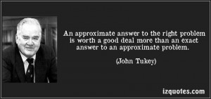
Tukey QuoteYou can definitely begin to see the possibilities

So why intersections vs. an “analytics maturity curve?”

Even before BIG DATA and analytics was the buzzword of choice, organizations have been assessed and self assessed their own technological maturity.  This, in hopes, of understanding where they stand vs. their own industry vertical and peer groups.  No one wants to get left behind…  This humble beginning was relatively easy in comparison to the constant disruption of innovation we face today. Back then, technology around data management kept us following the rules so to speak.  Breaking out of the norm was either too risky, too expensive or lacked the C-suite backing to ever evolve from idea to implementation.  As the ability to collect, analyze and share information became easier and easier the early adopters paved the way, proving that having more data leads to more insight which can directly translate into tangible, measurable business results.    How fortunate during this evolution that data availability was exploding… internet, social media, machine and manufacturing data,  financial data, shipment data, public data, forum data and on and on and on.

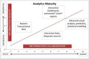
So the primary visualization has been to benchmark basic to advanced along a “CURVE.”

Maturity curve

There are endless variations to the above theme.  All good and some very insightful. My only apprehension is the curve suggests a “point of completion”, a landing spot where we say “DONE.” Let’s check analytics off our to do list.  The disruptive nature of insight leads me to believe there is no finish line, there is no point where your done with analysis.  On the contrary, the better our analytics discipline, the better your range of inquiry becomes.  “You get progressively sharper as ASKING BETTER QUESTIONS!!!” And there are no end to the questions as we learn more from the data.  I prefer the crossroads and intersections metaphor because it keeps you moving forward without the idyllic conception of a destination.  Not that you can’t enjoy the respite of a few rest stops along the way.  Intersections do provide critical decision points along your journey that allow for adjustments and ensure results are meeting expectations.

Through this lens we can understand the key markers of progress along the journey.

The intersection of:

 crossroads

  • technology meeting talent
  • from data to information to insight
  • investment meeting innovation
  • reporting meeting interactivity, eventually interoperability
  • data visualization meeting clarity and creativity
  • solution vendors meeting partnerships
  • analytics results meeting business success
  • AND… where the passion for insight meets possibilities

Plus, there are so many more.